Pantone Swatches: What They Are And How To Use Them

Summary: Designers, manufacturers, retailers, and even customers use Pantone Color System as the standard language when communicating about color. There are more than 3000 colors that are part of Pantone Swatch, each having a unique name and number. The Pantone Matching System brings a level of precision to textile and apparel manufacturing.
Pantone: The Color-Matching Standard
Colors are often the catalyst that creates the mood, defines the space, and ushers in sales in the ever-evolving and challenging marketplace. This phenomenon is common across industries. Brands have global teams of color forecasters who look into the movement of color trends to ensure a modern, relevant, and fresh color palette. These teams have an apt understanding of what kind of integral role colors play in developing the brand’s seasonal stories. For immediate usability and higher efficiency, only those colors are chosen by the teams that are easily reproducible and achievable.
What is the Pantone Color System?
When design teams label a color as Pantone color, they are referring to a color that matches the specification provided for in the Pantone Matching System (PMS). PMS is a proprietary, standardized color system used across many manufacturing industries. In PMS, colors are labeled with a number (for instance, PMS 125). Designers, manufacturers, retailers, and even customers use the Pantone Color System to communicate about color.
Since the parent company Pantone Inc. invented the labeling system, colloquially the color system is referred to as Pantone. Over 3000 colors are part of Pantone Swatch, each having a unique name and number.
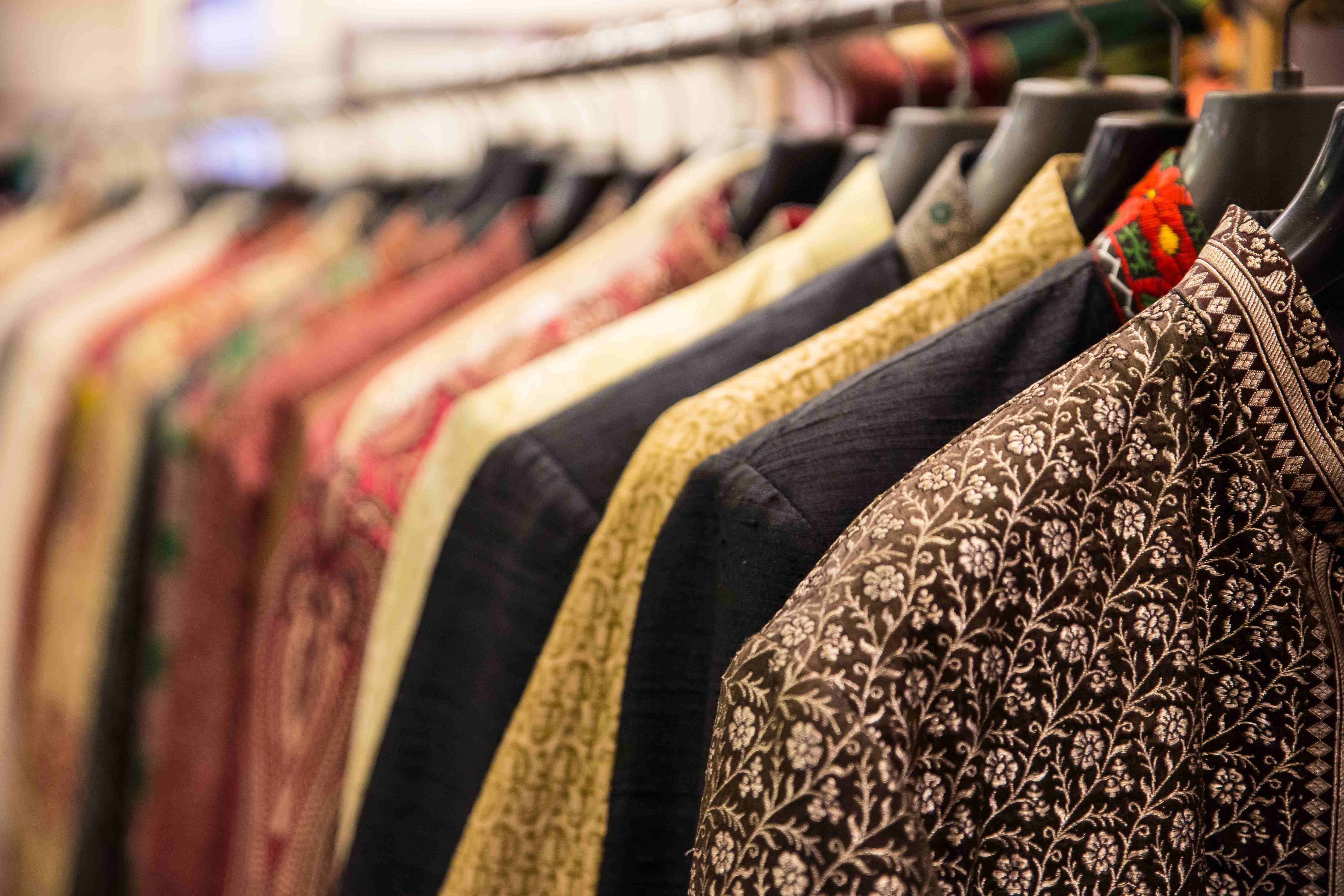
Pantone for Textile and Apparel Industries
The textile industry is one of the heaviest users of the Pantone Matching System. Fashion designers use Pantone Color guides to figure out their desired colors, following which they specify the label to a manufacturer or a printer. Following the Pantone guidelines, the manufacturer uses this number to replicate the requested color.
Accordingly, business organizations can communicate consistently about the desired outcome without any geographical or time zone restrictions.
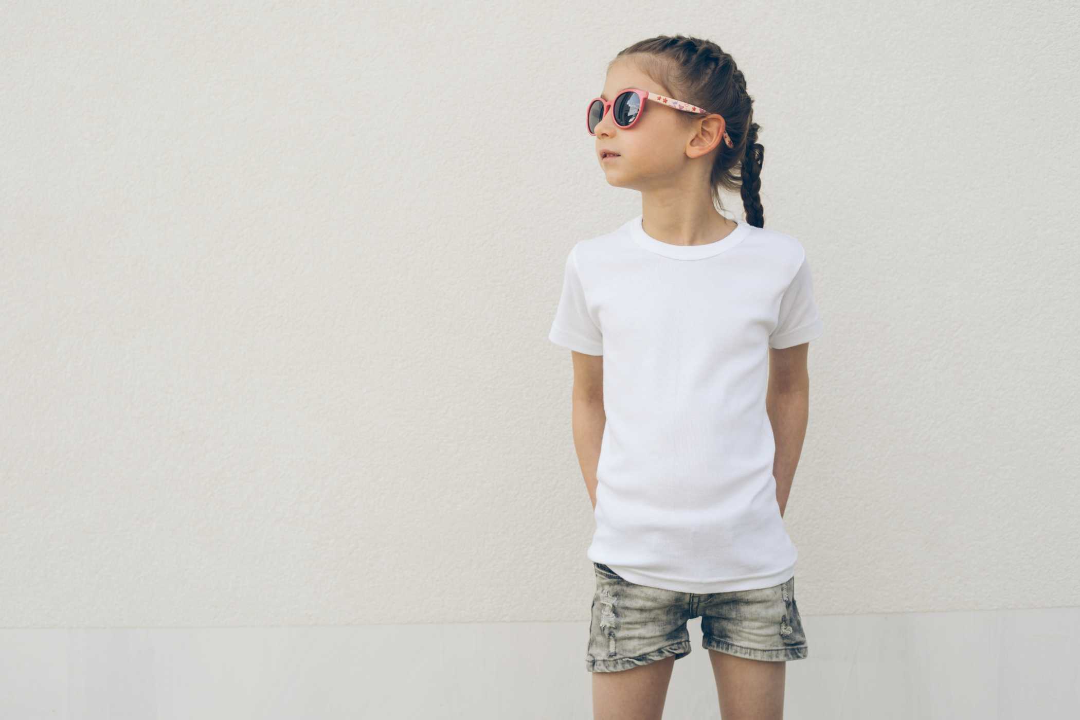
Let us say a designer wants to get a T-shirt printed in CMYK yellow swatch but is not using the standard Pantone Swatch, it is unlikely that he or she will get uniform manufacturing results if the production is happening over multiple locations.
How to Use Pantone Color Matching?
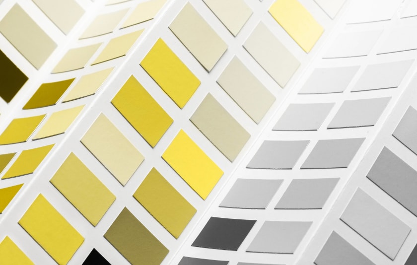
Pantone color matching brings a great level of precision to textile manufacturing and design production. Pantone offers a wide range of color guides. Brands can specifically choose the Pantone Swatch that is relevant to their industry and media type.
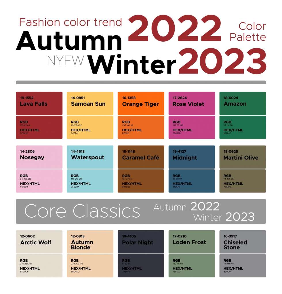
Pantone’s Fashion, Home + Interior is designed to achieve accuracy in color coordination at the global level. A color’s placement in the system is well-defined by the six-digit number assigned to each color. For instance, in the Pantone shade 16-1546, the first pair (16) denotes the lightness or darkness of the shade; the second pair (15) is about hues — yellow, red, blue, and green; and the last pair (46) describes the intensity of the color.
Pantone Swatches for Color Inspection
The common grouse of buyers worldwide is that the colors validated by them during the sampling process do not remain the same when the commodity is mass-produced. This is the primary reason why color verification is an integral part of the final inspection process. Typically, inspectors judge the color through their naked eye and then take photographs, which are then passed on to the client.
A more precise way to conduct this operation is to compare the finished good’s color using a Pantone swatch. Inspectors can match the label numbers of colors with the Pantone swatch and ensure that the specifications conform to those ordered by the client. In addition, inspectors must use the latest Pantone swatch because, with time, the inks printed on the swatch become yellowish and fade.
Alternate Color Systems
Color forecasting is increasingly becoming a crowded market as more and more brands realize the intrinsic value of color in their marketing and advertising strategies. For color-hungry manufacturers and designers, Pantone swatch is no longer the sole reliable option. Along with Shutterstock and Pantone, other noteworthy color system resources include RAL and HKS, which have a European origin. Japanese color printing brands, DIC and NCS, from the Scandinavian Color Institute have also gained significant popularity.
Go Digital with Color-Matching
The Pantone Matching System is a standardized and reliable technique to identify a specific color. With Pantone's digital color libraries, manufacturers can verify and match color specifications with a high degree of accuracy. Brands, however, must ensure that a fairly new Pantone swatch is employed for drawing color comparisons.
Key takeaways:
- Pantone eases communication around colors by providing a reference plane.
- The color matching system is now available digitally as well.
- Using Pantone swatches is an effective way to identify colors with precision.
Fashinza is a tech-enabled platform for connecting brands with manufacturers and suppliers. It provides services ranging from design to shipment.
Connect with Fashinza for seamless manufacturing solutions.
Share this Story