Pantone Brown: From Earthiness to Sophistication


Summary: The world is waking up to the earthiness associated with the color brown. As the sustainability movement gains ground, the color of soil is being seen in a refreshingly new light. This is being reflected in the evolution of brown by the Pantone color company.
Not a Color of Choice
Often associated with mud, Brown has not been a preferred color ever since the world started recording its penchant for colors. This, however, is no longer true. Designers have rediscovered the beauty of its tone. Brown is now a color that blends with a broad spectrum of design activities. The multiple shades of Pantone brown are finding their way into homes and fashion.
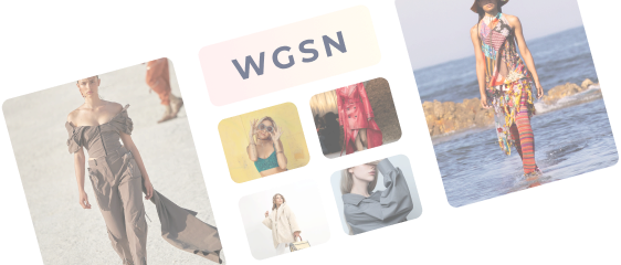
The color captured the imagination in the 1970s when it was widely used by interior designers. However, since then there had been a lull. At the 2021 Milan show, designers highlighted brown as the key color for interiors. Although apparel is just warming up to the different shades of brown, leather bags in various shades, specifically tan, have always been popular.
Evolution of Pantone Brown
Pantone, the American color company known to select the color of the year, is adding a brown palette. With retro in fashion, designers are looking back at the 70s and 80s when brown was not such a neglected color and was often used to lessen the impact of bright hues such as red and yellow.
Brown is the grounding color, capable of anchoring small and large spaces. The beauty of the color lies in the fact that it can blend effortlessly with a wide array of colors and bring them to life with a great deal of sophistication.
The evolution of a color depends on its relevance and ability to change the dynamics of the entire color story. For instance, brown when combined with red lessens the robustness and brings out the softer hues of the latter. When combined with pink, it suddenly becomes a color of refinement, and when contrasted with blue, it gives the sportiness of the 70s a whole new dimension.
Pantone Color Empire
The Pantone color system is aimed at the apparel, textile, and paint industries. The colors are meant for varied areas from textiles to wood and walls and work through the mediums of cotton, plastics, pigments, and coatings.
The mapping of colors and shades enables design professionals across many industries to choose colors for projects with precision.
Designers across the globe can communicate about colors easily through Pantone's common reference map of colors. The company keeps updating the color creatives to keep up with changing tastes. Color language plays a strong role in apparel designing and color matching. It is a dynamic art that keeps changing as humanity captures new colors that nature has to offer.
Two Groups of Pantone Brown
Pantone also acknowledges that brown changes our perception of the colors around it in a special way, which had previously been overlooked. This is what is giving the color an edge in the preference code of the designers. Its ability to neutralize bright colors and enhance light colors is what is making the designers look at the color with renewed interest.
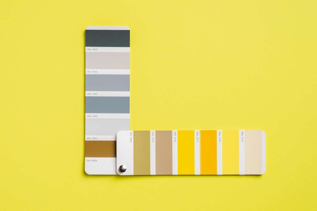
Pantone has created two groups of browns considering its rising demand among designers. The first one is rich with undertones of blues and reds, creating a sophisticated warmth. Mahogany and teak are a part of these tones and convey a real sense of luxury with their woody hues.
The second one has a yellow and green tint, creating a natural and organic feel, resembling the forest floor. These can be used for a retro spin in interior design and athleisure.
Added Boost for Brown in the Digital Palette
With implementing digital solutions for its design system, Pantone has also introduced 315 new colors and a new digital organizing system to ease the efforts of choosing the right color from the map. The company is adding new colors across the palette.
The company has also restyled the system for designers. The formats have been reworked so that designers can find the right color and shade faster out of a choice of 2625 shades. Along with other colors, the brown shade card has also got added hues.
Pantone Brown on Roll
As brands make the move to adopt greener practices, the color of soil is also gaining wider acceptance. With Pantone diversifying its color palette, it’s time for designers to experiment with various shades of brown. This is one color that lends itself beautifully to the retro ensemble.
Key Takeaways:
· There is changing perception of how the colors combine with shades of Pantone brown.
· Something which has been previously overlooked in brown has now become an edge.
Fashinza works with a select group of suppliers to provide brands with ethical manufacturing solutions.
Log on to Fashinza if you are looking to work with suppliers with verifiable track records in sustainable manufacturing.
Share this Story