The Pantone Palette: Pantone Colours of the Year 2022


The Pantone Matching System, also known as PMS, was created specifically for printing projects. PMS allows designers to have a greater degree of control over the colours. It’s an alternative to the mainstream CMYK System. Colours that cannot be mixed in CMYK can be specified in PMS. The Pantone colour system has over 1000 colours in it. These include but are not limited to metallic and fluorescent colours. From a technical point of view, the Pantone colour system is very well optimised. Each colour is identified with a code unique. PMS 205, for instance, is the code for the colour pink.
The Pantone colour system is popular because it offers designers a more comprehensive colour collection. Moreover, it also helps with the standardisation of colours. With this system, designers all over the globe can use the same colour without any complications. Thus, PMS is the reason why brands are able to keep a consistent colour palette across ad campaigns throughout the world. This system of colour is specifically designed to streamline and standardise colour-related communication between designers and manufacturers. With PMS in place, there are no colour palette errors during the production of branded material goods. If PMS didn’t exist, then you would see inconsistencies in the colours of branded goods.
This system was founded by Lawrence Herbert, who started a limited liability company in the late 1950s. In 2007, this company was acquired by X-Rite for a whopping 180 million US dollars. Following this acquisition, the company again underwent a change of management in 2012 when it was bought by Danaher Corporation.
Importance of Colour in Fashion
Colours are the foundation upon which the whole fashion industry is built. Most people choose their outfits based on colours. The choice of colour in clothes is quite subjective. However, certain colours do better than others objectively. For instance, a bright orange shirt won’t sell as much as a matte black shirt. However, bright orange caps are almost as popular as black caps.
Another interesting thing about colours in the fashion industry is that they are used to express ideas. One can use colours for a variety of purposes, including expressing dissent. Many people wear black during protests. Black is a colour that is associated with negativity, mourning, and opposition to authority. There are also cultural biases that come into play in fashion. For instance, clothes with dark shades do not sell well in Eastern cultures, as they are often associated with negativity. However, with modernisation and globalisation, that perception of darker colours is changing rapidly.
Pantone Colours of the Year 2022
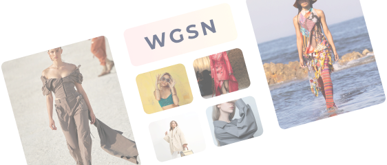
Pantone colours are extremely popular among fashion designers. Every year, the trending colours are posted by various fashion-related websites and magazines. That way, people can know what colours are currently in fashion and buy apparel accordingly. A layperson might not understand the importance of trending colour palettes. However, for a seasoned fashion designer, the right colours can lead to a hit clothing line. After all, most people pick out clothes based on their colour. You must’ve noticed that certain colours are generally avoided by a large section of individuals. For instance, you won’t find anyone wearing yellow formal shirts.
In the modelling industry, keeping track of trending colours also becomes important, as that industry is all about appearances. Models have a better shot at making it big if they present themselves well and in line with current trends.
To help you choose the best colours possible, here is a list of some breathtaking Pantone colours of the year 2022:
1. 14-0952 Spicy Mustard
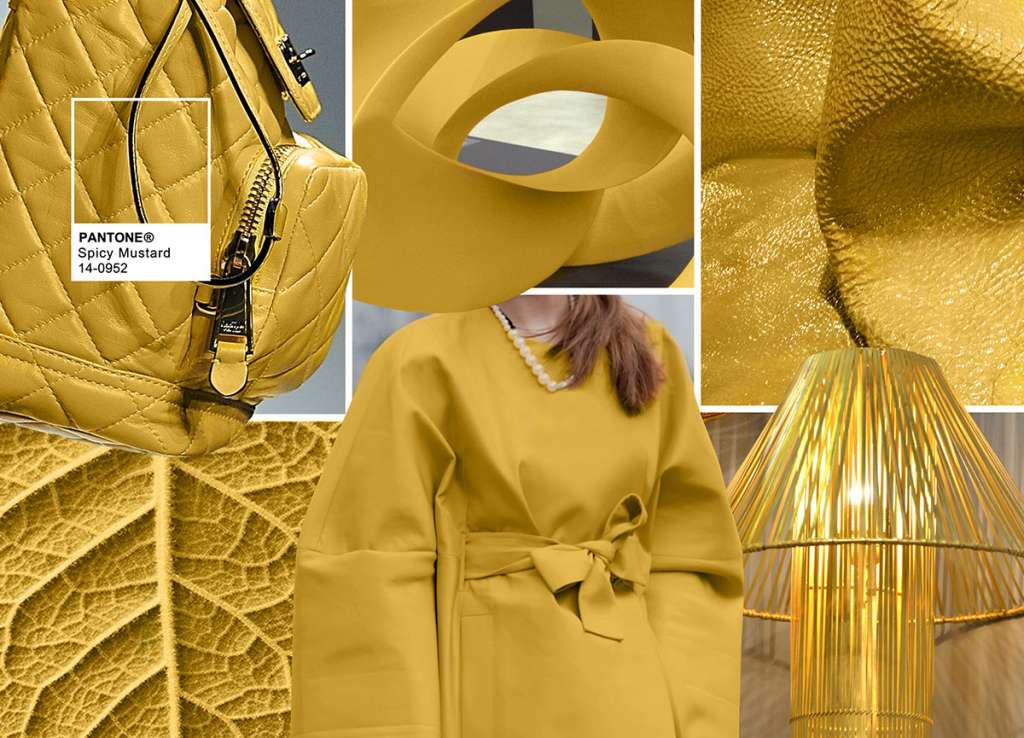
This bold colour has really taken the year 2022 by storm. It’s the perfect Pantone colour to make a fashion statement. Spicy mustard is the perfect colour for a casual vibe. It goes very well with t-shirts as well as brands logos that have a very casual aura to them.
2. 13-2005 Strawberry Cream
If you’re looking for a cute colour to liven up your clothing line, then 13-2005 Strawberry cream is the colour for you. This colour can be described as a lighter shade of pink. This was one of the most popular colours in the winter/autumn colour palette. If you want to fight the winter blues, then strawberry cream is one colour that you should look for in your outfits.
3. 19-1419 Chicory Coffee
Nothing is classier than shades of coffee when it comes to clothing. Chicory coffee is one Pantone colour that looks amazing on almost all outfits. Whether it be formal or informal, outfits in chicory coffee will likely be a fine addition to your wardrobe. Moreover, the popularity of coffee shades is rising exponentially. Perhaps, this is due to the special place that coffee holds in the hearts of most working individuals.
4. 18-6026 Abundant Green
This pretty colour is not only welcoming but also friendly. It is that perfect shade of green that every designer craves. Moreover, it’s a perfect pick for any brand that is associated with environmentalism. It’s neither too bright nor too dull.
5. 16-1460 Dragon Fire
This bright mix of orange and red is another strong contender for the boldest colour on the 2022 Pantone colour palette. Mostly seen on scarves and other accessory clothing items, 16-1460 Dragon Fire is a colour that will not go out of fashion anytime soon. It’s very much possible that we’ll be seeing this colour in the trending Pantone colours of 2023.
6. 19-3526 Meadow Violet
19-3526 Meadow Violet is as subtle as any shade of violet gets. It’s an enchanting colour that has a magical vibe to it. It’s perfect for kids’ wear as well as party wear. Those who love to experiment with their wardrobes would definitely want to give this colour a try.
7. 19-4021 Blueberry
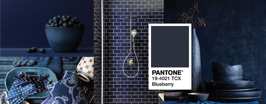
This darker shade of indigo blue is perhaps the best Pantone colour for formal clothes. Any shirt in this colour is bound to look amazing. Coupled with black or white trousers, it can really help you stand out from the crowd.
8. 17-4032 Lichen Blue
If you’re not looking for something as intense as 19-4021 Blueberry but still need something in blue, then you should consider 1-4032 Lichen Blue. This colour has a calming effect to it, and it does look good on a majority of clothing items.
9. 18-4006 Quiet Shade
The 18-4006 Quiet Shade is one of the core classics of the Pantone palette. In other words, it’s one of the most popular original Pantone colours. Thus, it’s no surprise that it keeps trending year after another. If the preferences of customers are taken into account, the demand for this colour will not be dwindling anytime soon.
10. 15-1040 Iced Coffee
15-1040 Iced coffee is another shade of creamy brown. This colour is often seen on trousers and pants as it provides contrast against bright formal shirts. Thus, if you’re looking to complete your formal attire, then you should get trousers or pants in this colour.
The perfect Pantone colours will vary for different designers. After all, the aesthetics of these colours are based on subjective preferences. However, it’s usually observed that the core colours of the Pantone colour palette tend to not go out of fashion. Even if they do, they make a comeback within a couple of years. If one was to consider the overall shades that are trending this year, then it’s clear that 2022 is the year of the blue. From Lichen blue to meadow violet, the whole world is going blue. It's an evergreen (no pun intended) colour that goes well with almost everything. Thus, you won’t really regret going with blue clothing items.
Conclusion
Fashion designers put a lot of thought into choosing colours for their clothing lines. After all, the fashion industry is all about visual aesthetics. Anyone can play it safe by using those boring old colours that are as common as flukes in an ocean. Going for something different and unorthodox requires courage that not a lot of designers have.
If you’re into designing and art, then you should definitely be aware of the Pantone colour palettes. Not only is it a professional requirement for almost all fashion designers and fashion artists, but it also provides a designer with ample options in terms of colour palettes. With proper knowledge of what’s trending and what’s not, a fashion designer can easily put out a clothing line that can resonate with people and expert designers alike.
For up-and-coming designers, it’s vital that they take a look at the Pantone colours for the year 2022 to stir up their creative juices. Browsing different colour systems can help a new designer gain a lot of insight into how colours actually work in the fashion industry. If you want to know more about the specific role of colour in the discourse of fashion, then be sure to visit Fashinza.
Share this Story