Gold Pantone Color: Code, Meaning, and Complementary Colors


Summary: Explore the meaning and symbolism of the Gold Pantone color and find out the best complementary colors to pair it with. Gold Pantone is a classic and elegant color, exuding luxury, wealth, and prestige. Learn how to use it in various design projects and achieve the desired effect by using complementary colors and neutral shades.
Gold Pantone color is a warm and classic color that exudes luxury, wealth, and prestige. It is a color that can be used in a variety of design projects – from fashion and interior design to branding and advertising. Understanding the code, meaning, and complementary colors of Gold Pantone color can help you achieve the desired effect in your designs.
Color code of Gold Pantone color
The Pantone Color Matching System (PMS) is the industry standard for specifying and matching colors. The code for Gold Pantone is 871 C. This code can be used to match the color in various printing processes, such as offset, digital, and screen printing. This ensures that the Gold Pantone color in your design is consistent across different mediums and platforms.
Uncover the wealth of meaning and symbolism behind the luxurious gold color

The meaning and symbolism of the Gold Pantone color are rooted in its association with luxury, wealth, and prestige. Gold is often associated with royalty and wealth, making it a popular choice for branding and advertising in the luxury and high-end markets. Gold can also symbolize success and achievement, making it a popular choice for awards and trophies. In addition, Gold is also associated with the sun, warmth, and light, which can be used to create a sense of elegance and sophistication in design.
Golden hues, endless complement possibilities
When it comes to complementary colors, the Gold Pantone color pairs well with a variety of hues. Navy blue, olive green, and deep purple can help enhance its rich tones, while neutral shades like beige and gray can provide balance. These colors can be used to create a bold and elegant effect in your designs. For example, pairing the Gold Pantone color with navy blue can create a classic and sophisticated look, while pairing it with olive green can create a more modern and organic feel.
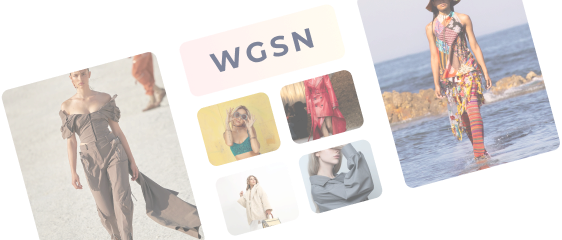
In fashion: Gold Pantone color is often used as an accent color to add a touch of luxury and elegance to an outfit. It can be paired with many other colors, such as black, white, or red, to create a bold and striking look. Gold can also be used as the primary color in an outfit to create a look that exudes confidence and sophistication.
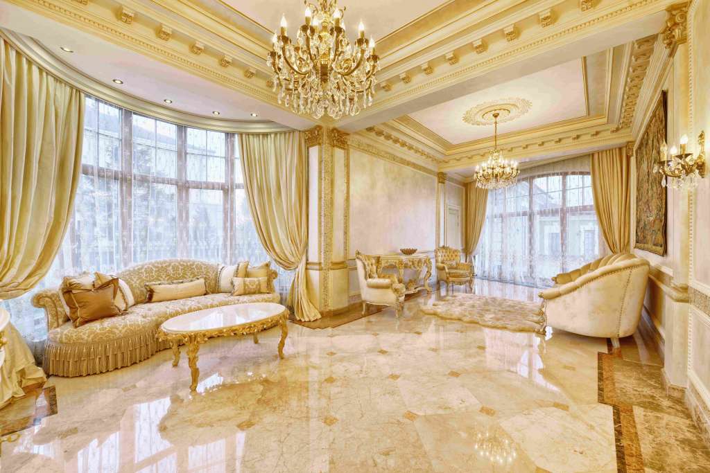
In interior design: Gold can be used to add a touch of elegance and luxury to a space. It can be paired with neutral colors, such as beige and gray to create a classic and timeless look. Gold Pantone color can also be paired with bold colors like deep purple or olive green to create a more modern and dynamic look.
In Brands and advertising: Gold Pantone color can be used to create a sense of luxury and prestige. It can be used as the main color in a logo or branding materials to create a strong and memorable visual identity. Gold can also be used as an accent color, to add a touch of elegance and sophistication to a design.

Shine bright with the Gold Pantone color
As fashion manufacturers and designers, you are constantly seeking new ways to innovate and create fresh, exciting designs. Gold Pantone color is an excellent option to consider for your next project. Not only does it exude luxury and prestige but also it has a versatile range of uses within the industry.
When using Gold Pantone color in your designs, consider the complementary colors that enhance its rich tones. Navy blue, olive green, and deep purple are a few options that can add depth and dimension to your pieces. Neutral shades like beige and gray can also provide balance to the gold color, making it a versatile option to pair with many other colors.
The color of success and luxury
For centuries, gold has been a symbol of wealth and prosperity. Egyptians also used it as a symbol of power. With time and the introduction of other materials, gold has taken a different role in fashion. There’s no doubt that it is one of the most attractive colors used in fashion, interiors, and advertising. Gold symbolizes wealth and prosperity. This is why just about every luxury brand uses gold in its designs. It is associated with success, which makes it the first choice for awards and trophies, wherein it usually combines with black. Using Gold Pantone color can lend elegance and sophistication to an outfit.
Gold Pantone color is a versatile and valuable option to consider for your next fashion project. Fashinza can connect you with partners to create designs that match your brand’s aesthetic. The platform also brings you the latest news and updates from the fashion industry to help you create bold and elegant designs with trending styles.
Key Takeaways

- Gold Pantone color exudes luxury, wealth, and prestige and can be used in many design projects, from fashion and interior design to branding and advertising.
- Understanding the complementary colors that will enhance the rich tones of Gold Pantone color helps create a bold and elegant effect.
- Brands can use the Gold Pantone color to radiate luxury, wealth, success, achievement, elegance, and sophistication through designs.
Connect with Fashinza to create your latest collection today
Share this Story