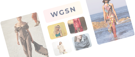
Designers’ Guide to Post-Pandemic Trending Colours of 2022-2023


While we grapple with the immense effects of the pandemic in 2022, our new lifestyles, habits, and general mental well-being will continue to influence the way we choose to style ourselves. While recent colour trends through most of 2021 generally leaned towards comfort and stability, fashion experts and trend forecasters predict a more bold and subtle palette in the coming months. So what does this mean? Colour is coming back.
As we’ve seen in the past few years, the colour trends of 2022 are largely a reaction to eye-grabbing, in-your-face trends. The truth is that we’re a bit burned out this year, so rather than the loud colours that dominated the design space in 2020 and the safety and comfort of 2021, we’re opting for toned-down, muted hues with a bit of pop that represents a more serene, lighter approach. But do not mistake these colour trends as boring or old-fashioned - you'll discover that many of them are contemporary and creative spins on previous trends, which revitalise them and reposition them for the 21st century.
How about seeing what colours you'll see in 2022 and beyond? Here are some of the upcoming colour trends for 2022.
- Pastels with a twist
There’s nothing quite like pastels for springtime. They are soft; they’re sweet; they’re the best. There will be more designs in 2022 that take pastels in new directions. That direction might be pairing them with geometric shapes, line illustrations or a full-on, funky display of them in maxi-style patterns that display objects, colours and patterns that reflect the artistic soul.
The use of pastel colours in unconventional and creative ways creates disharmony or edginess by twisting expectations. Their vibrant pastels are paired with neons and intricate patterns or are saturated to create bolder pastels. It has the soothing effect of pastels but with vibrant and unexpected colour patterns. It's not totally bizarre, but it is certainly not boring. The material is soft but spiky. We push boundaries by reinventing and reimagining familiar colours.
- Rustic, earthy tones
Throughout the coming season, designers will embrace a variety of muted colours. Colour trends have been on the rise for the past several years, but this year's colours are in stark contrast to the neon and bright colours that dominated previous years. This could be due to the fact that we are collectively feeling exhausted by our loud, brash, bright world. Many of these colours evoke a rustic vibe that feels calming and refreshing, giving their designs a feeling of calm and naturalness. Brands can distinguish themselves from their competitors by using muted colours.
Muted colours may be helpful if you work in an industry where everyone uses bright colours. In a similar way, brands who wish to communicate their commitment to being slower-paced, natural, organic, and perhaps more thoughtful than others can use muted earth tones for their apparel.
- Retro flower style
Floral hues in toned-down, desaturated colour palettes, which often appear in floral patterns, are among the colour trends that are predicted to dominate in 2022. Flowers are designed in muted colours to give them an appearance of being dried out and yellowed. Through the use of such palettes, designers can create floral patterns that feel comfortable, earthy, and old-school.
With desaturated and toned-down colours, designers create floral designs that have a retro feel - retro in the sense that these flowers have aged and are dried out. The message is that these flowers are fragile and intricate, so handle them gently.
- Calm and airy tones
In 2022, we can look forward to more calm colours. We can expect to see watercolour designs, minty shades, and eggshell finishes in addition to pastels and muted tones - all designs that make you feel airy, cool and comfortable, almost like you're floating or lying on a cloud. Discover the different ways in which designers are creating an airy feeling with soft colours and uncluttered designs, paired with simple, calm typography. People are seeking comfort after the lockdowns they've just had, but not the same type of comfort their sweatpants offered. In 2022, we will be seeking psychological comfort through simple colours that radiate a sense of light and air.
- Retro colour schemes
A soothing design can be created by either using muted or soothing colours or by evoking memories of simpler times. The world has always been teetering on the edge of crises and challenges, but in design, perception is key.
Many people believe the past to be less stressful and more straightforward than the world we live in today. It seems that designers have started embracing those rose-coloured glasses and are using colour palettes straight out of the 1970s and 1980s.
- Colour contrast
These designs are quite different from the other 2022 colour trends, which went for calming colour palettes; they are loud and overstimulating, but when done well, they create something quite interesting and fun! Their focus is not just on grabbing attention, and they compete for it as well. The result is a visually stunning experience that you won't forget anytime soon.
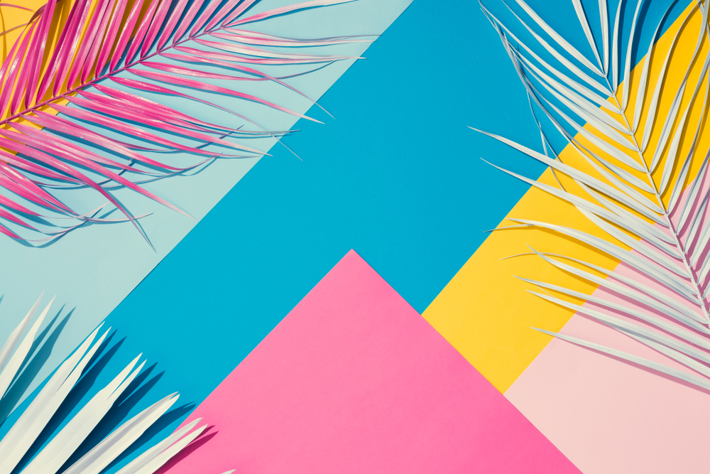
- Jewel tones
Gemstone tones are bold hues derived from gemstones, such as a sapphire’s beautiful blue or a garnet’s deep red. Despite their high saturation levels, jewel tones have a different feel than other bold colours like neons, which feel more subdued and even stately, owing to the fact that they’re typically associated with gemstones and, therefore, with royalty.
- Memphis design
From the 1980s, Memphis design has become one of the most recognised styles. Colourful, abstract, geometric shapes and squiggles dominate the aesthetic, rejecting the high art and minimalism of previous generations. Today, after years of polished, minimal colour palettes, Memphis design is bringing quirkiness back into the mainstream by bringing back abstract shapes and colour combinations.
Essentially, we get a colour palette that is playful, fun and doesn't take itself too seriously, which is exactly why it's returning big time in colour trends for 2022.
- Pantone colour of the year
Lastly, the Pantone colour of 2022 is Very Peri, a daring and intriguing hue that captures the desire for novelty and creativity that lies ahead. Periwinkle blues are blended with violet-red undertones for Very Peri. Taking inspiration from some of the characteristics blue represents, combined with a point of view that resonates with today's world, Pantone Very Peri allows us to see the future in a new way.
Pantone wanted to capture how colours can communicate and express thoughts and feelings, so it created this colour to reflect where we are and what we want to achieve moving forward. Very Peri helps us embrace the possibilities that lie ahead. It is a colour that enables us to grasp and embrace possibilities we cannot see today—experiencing a renewed sense of hope and excitement about the digital space, embracing it, and expanding our imaginations about what could be.
Fashion has a mood-boosting effect, and that is what it is doing post-pandemic. There will be a lot of colours dominating the mainstream collections in ready-to-wear, footwear, bags, and quite a few other fashion accessories. With the return of life and freedom of expression, this year’s runways were filled with bold, bright and positive colours. They are also a way for people to celebrate love and have another opportunity to dress up in bright colours.
Coloro and Pantone have released nearly 28 shades designed with all the essential colours needed to create stunning dramatic prints and inspiration for functional fabric trends based on 3D colour.
These colours embody our desire for luminosity in the techno era. The 3D artwork of different brands is bringing their colour nostalgia into their NFTs, and digital catalogues are gaining a lot of traction. With papaya orange, kiwi colada, and bubble gum pink, some of the trending tones are reminiscent of Miami during the 80s. Most digital colour inspiration is pointing towards colourful purples, blues and neons that are striking and magical. This, in turn, brightens up our artificially enhanced fashion world. Our latest fashion colours have been based on optimism and enthusiasm as it rained from time to time outside our homes, making our brain want a little boost of happiness.
Despite the world still reeling from the ravages of the pandemic, consumers are willing to give irresponsible fashion a chance, going for unapologetically upbeat colours which offer optimism and joy. Having to deal with loss, global lockdowns, and suffering, people have gravitated towards colours that offer reassurance, comfort, and a sense of hope during disasters. After the pandemic, consumers' appetite for neutral shades rose exponentially as they searched for comfort and safety. This year, people are choosing more saturated colours than pastels to express their power as opposed to last year.
Connect with Fashinza to ease your manufacturing process. We’ll make your manufacturing and supply delivery smooth like butter. Just place an order and see your collection appear!
Share this Story