7 Tips for a Distinctive Fashion Website: A Cheat Sheet for Better UI/UX

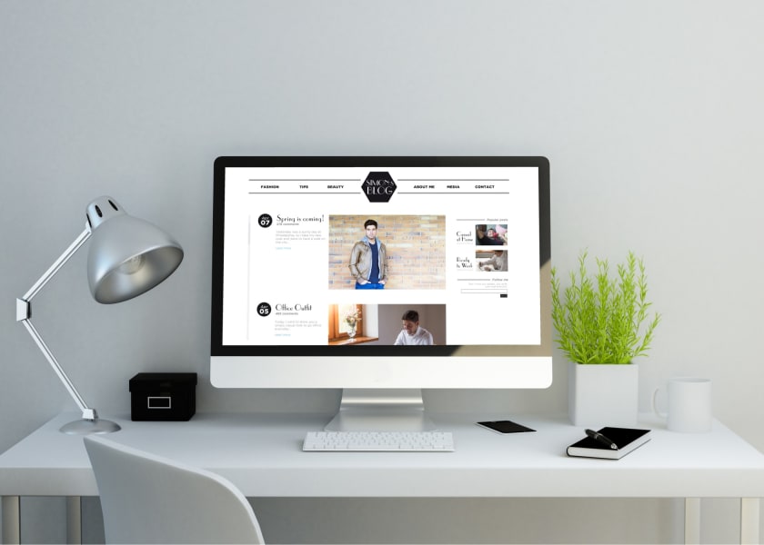

Back in the day, fashion brands used to display their apparel in larger-than-life showrooms. They used to invest heavily in display items. But the recent pandemic has changed the way of doing business in fashion.
Nowadays, people are spending more time on the internet than ever, be it for shopping or entertainment. And this is enough reason for any fashion brand to focus on improving user experience on their website. The best user experience is when your customers can feel the clothes than just see them. It is also when they can connect with your brand. And this is only possible when your fashion website is visually compelling and user-friendly.
But what makes a fashion website more appealing to its customers?
Is it a perfect-looking photograph?
Or an eye-catching color palette?
Well, it’s more than this.
A user-friendly fashion website should have high-quality photographs, a clean layout, an easy-to-navigate interface, and a lot more. But you need not worry. We have decoded it all for you.
This article features seven tips to make your fashion website stand out. And make it more appealing to your customers. So, read till the end to learn how you can improve user experience on your fashion website.
Hacks to Make Your Fashion Website Stand Out
1. Create a strong yet appealing brand identity
Brand identity is a representation of what your brand stands for. In simpler words, it is your brand’s personality. It is also about promoting your brand values through visual elements. And what better way of doing it through a website.
You might already know that brand identity is more than your logo. It should come out through various factors such as product packaging, print materials (flyers and brochures), website, and social media channels.
A strong brand identity helps you stand out from your competitors, as it speaks about your values. It also helps your customer remember and recognize your brand.
Where can you use brand identity as a fashion brand?
- Marketing channels: Showcase your brand identity through newsletters, emails, social media channels, flyers, brochures, cards, etc.
- Apparels: Apparels being the main product of your business, should speak of your brand values.
- Visuals on the website: Use images that reflect your brand personality. And be consistent with it.
2. Make your fashion website more visual than textual
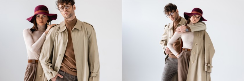
Fashion is visual. Your products should appeal to customers' eyes for them to make a purchase. And the same principle applies to a fashion website.
Your photographs should speak for your brand. It also adds to your brand identity. You can make good use of photographs, illustrations, icons, call-to-action buttons, etc. All of these must be aligned with your brand identity.
But this doesn’t mean you should not add any text. You must balance visuals and text on your fashion website. However, make sure the visuals on your website are more prominent. You can add text to your blog. We have talked about it in the following points.
Making good use of white space on the fashion website also contributes to attention-grabbing visuals. Do you know how to use it effectively? It is explained in the next point.
3. Make effective use of white space
White space on any web page is a space between two elements. The purpose of white space is to create balance and harmony in design. It also helps navigate users from one element to the other. White space gives your website a decluttered look, making it look less crowded.
How to make effective use of white space for a fashion website?
- To create focus and emphasis: White space helps remove distraction, hence creating emphasis on important elements. So use white space around elements that you want to be noticed by the users.
- To structure your content: White space helps direct users from one element to another. So use it in a way that follows the hierarchy of the information on the website.
- To give an impression of elegance and luxury: Make generous use of white space that adds luxury and elegance to your fashion website.
4. Use more customization than templates
No matter what platform you choose for your fashion website, avoid using ready-to-use templates. These templates make the job easier for a designer but are a threat to your brand identity.
If you want your fashion website to stand out from your competitors, ask your designer to customize web pages according to your brand needs. And here are the reasons why you need to do it.
Why should you customize your fashion website?
- It makes your website look remarkably different.
- It gives a refreshed feel to your users.
- It makes the content align with your brand identity.
5. Use original photographs of your product and not stock images
The easiest way to disappoint your users is to use stock images. As we mentioned earlier, fashion is visual. People will only buy from you if they like what they see. And you can use it to your best advantage by using original photographs of your apparel.
Also, make sure you are adding photographs of humans wearing your clothes and not a mannequin. It will give a human touch to your fashion website. And it will give an idea about how these clothes will look on real people. Adding a human touch helps your users connect with your brand. So make the best use of it.
You can also create a gallery that showcases your products. Do not forget to add videos that give a 360 view of your clothes. Also, add photographs of your clients as testimonials. It will help build trust with your users.
Now that you know enough about visuals on your fashion website, you can focus on the textual content.
6. Add content about fashion

You can educate your users through your fashion blogs. It will also help users connect with your brand.
You can write blogs about the latest trends and news in the fashion industry. You can entertain users with celebrity news and updates.
Focus on the elements like the font’s readability, background images, color palettes, animation, and transitions on web pages. These elements will help you build brand identity.
Also, make sure your fashion blog is search engine optimized. It will help you get more traffic. And more traffic means more customers.
7. Create a responsive fashion website
A responsive website is a web design that changes dynamically depending on the screen and orientation of the device. As most people prefer using mobile and tablets to browse on the internet, a responsive fashion website is an essential part of a good user experience.
How to create a responsive fashion website?
- Set appropriate responsive breakpoints: Responsive breakpoints are also known as CSS breakpoints or media query breakpoints. These breakpoints ensure the content on the website aligns itself to facilitate visual consumption by users.
- Use a fluid grid: A fluid grid maintains visual consistency across devices and also offers control over the alignment.
- Use responsive fonts, images, and videos: It requires a little bit of coding effort, but the designer should be able to build it for you. You can also save time by using a pre-designed layout.
So, these are the necessary points that will help you build a responsive fashion website.
A compelling visual experience makes users spend more time on the website and help them connect with your brand. And this guarantees more customers. So, put in all efforts in making your fashion website stand out and generate more revenue.
If you need any help with sourcing materials for your fashion brand, feel free to contact Fashinza.
