30 Planogram Ideas for Retail To Put Maximum Products on Display

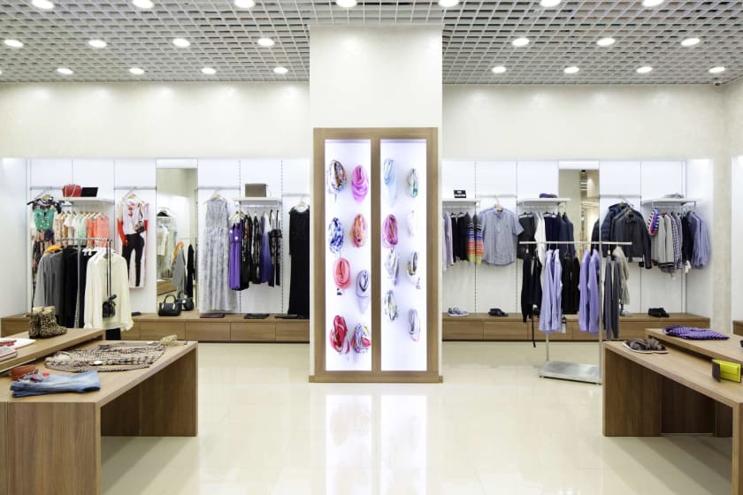

The efficient utilisation of real space is critical to the success of any brick-and-mortar store. Planograms are visual representations of a store's services or goods on showcase. It is also referred to as plan-o-grams, designs, and POGs. Planograms are precise diagrams of a store's organisation, with a focus on product placement. The utmost important objective of planogram is to plan the store so that maximum products are on display to customers.
Planogram in the retail industry is regarded as a visual merchandising technique. However, it is not a permanent solution and the only successful strategy for your visual merchandising requirements. Planogramming can also be termed as a space planning technique. Below are the 30 planogram ideas for retail to put maximum products on display.
- The Minimalist Methodology
A cluttered display is the result of far too many things and conflicting accents. Therefore, presentations should be clean and neat so that the customers get exactly what they want. To establish a cohesive motif, focus on highlighting a single object or a few related ones.
- Keep Colour in Check
Colour contributes to a unified visual experience in any store. The colour scheme should complement the branding of the store and also its sales goals.
- Storytelling
A narrative for the planogram in retail displays aids the layout process and the customer's interaction with the goods. The storytelling might be confined to a single exhibition or created to flow over the whole store area - by employing a single consistent theme from one display to the next.
- Make Use of Lighting
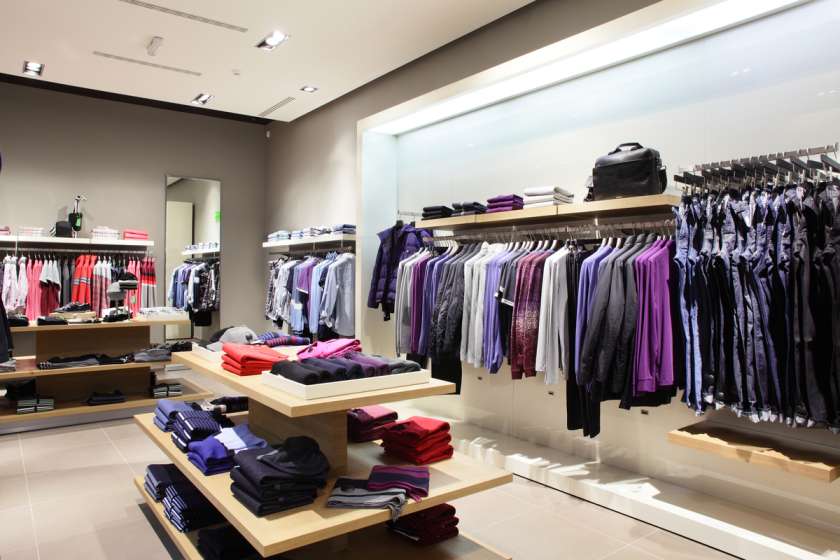
A lighting design is an integral part of completing any display. Make sure your lighting illuminates the whole room. Ensure that the lighting you choose sets the tone for your location and corresponds to business.
- Developing Interactive Experience
Bring consumers into the business by providing an experience that they can't get via online buying. It might range from creating dynamic snap-worthy spaces that encourage customers to share their thoughts to creating realistic experiences such as product customisation stations.
- Use Signage
The planogram is a diagram that depicts the relationship between the objects in a retail store. But if the signage fails, the entire display fails. A great planogram merchandiser avoids signage with a lot of text since too much detail is ignored.
- Technique for block arrangement planogramming
Block placement is the most straightforward method of brand awareness in the marketplace. All items from the same family are grouped in this planogramming approach, regardless of their brand equity or profit percentages.
- Point of Purchase Displays
POP can advertise product features, highlight special offers, or bring attention to a compelling item. While POPs are limited to a single product category, they are specialists and primary sellers.
- Using on-site storage
A planogrammer can compete with the range and amount of merchandise given to internet customers by adding in-store items. Businesses can store more items by simplifying store floor space and attaining a more clean design with on-site storage options like PODS boxes.
- Elevating technology
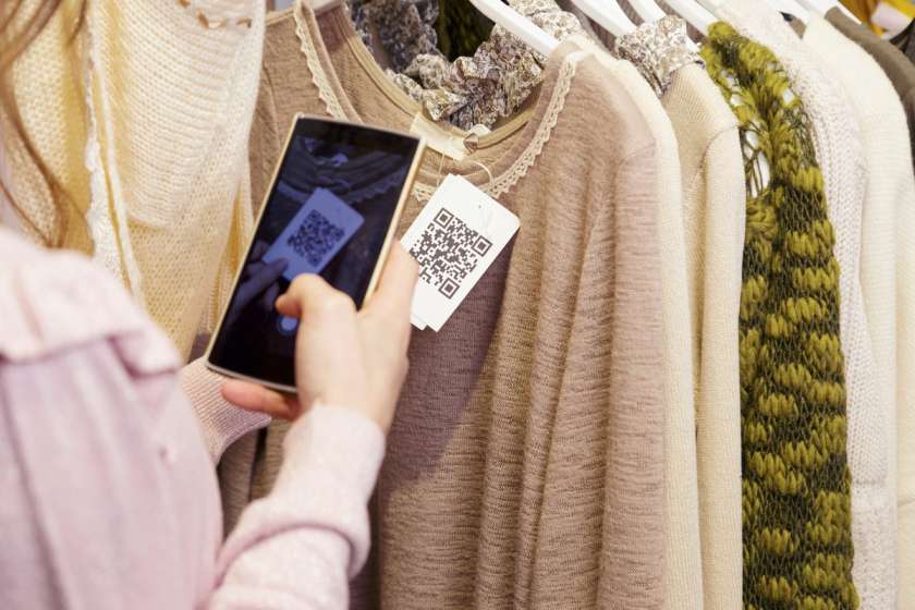
Add technology like robots, changing rooms with selfie mirrors, exposure to virtual inventories, kiosks with 3D size scanners, app-and-store connectivity, and QR scanners and self-checkout aisles to take the customer experience to another dimension.
- Window Displays with a Solid Base
To encourage foot traffic, place fresh and more valued items in the storefront or near the door. It's true that first impressions matter. Again, the writing should be clear, simple, and related to the window's subject or message.
- Curbside and in-store pickup zones
During the COVID-19 pandemic, customers and merchants needed curbside and in-store pickup. Hence, re-examining the retail locations to prepare for additional spaces like sidewalk pickup facilities is an excellent tactic to follow.
- Use Focal Points to Target the Right Audience
By making retail items aesthetically appealing and intriguing, focal points help to advertise them. A cluster of figures, an object wall art, or a tabletop display may all serve as focal points. They generate visual appeal and encourage consumer interaction without requiring the creation of a new shoppable area.
- Weekly Sales Analysis and Display Changes
An additional touchpoint in the customer's decision-making process is visual merchandising. It's critical to examine weekly sales and identify if and how displays impact sales to be practical. A comprehensive planogram in retail may boost sales by playing a crucial role in ultimate engagement.
- Creating a Comfortable Retail Environment
The seamless integration of sofas, lounge chairs, tables, lamps, or things displaying comprehensive sets of real scenarios is an ideal place to start when looking for unique methods to show products.
- Set the mood in the store by playing music.
Planogram in retail is incomplete without engaging customers' audio sense. Music should not be distracting and reflect how the retailer wants people to feel when they visit their establishment.
- Pop-Up Shop Mastery
Limited-edition clothing or products, a rolling product-of-the-month, private label food and drink, meet-and-greets or picture opportunities, or even highlighting small local companies are all possibilities for in-store popups.
- Horizontal planogramming
In this approach, products are positioned horizontally on the side-by-side racks at the very same eye level. Customers may readily learn about similar items from other businesses in this way.
- Analyse the navigation
The layout has a significant impact on how consumers navigate around the shop. The number of goods, capacity, display sense, and traffic flow in the business need to be considered when deciding on the optimal layout for the store.
- Counter-clockwise vs. clockwise
Because most of the market is right-handed, customers intuitively turn to the right; that is why retail establishments employ counter-clockwise space arrangements. However, planogram merchandisers have recently chosen an anti-clockwise format in the hopes of attracting customers' attention.
- Floor Plan in Diagonal Direction
The diagonal floor plan, which contains shelves and showcases set at a diagonal, is ideal for self-service retail outlets. It allows for greater mobility and improves flow, and makes the area more welcoming and customer-friendly.
- Minimise space
Keeping the retail store consumers attracted means avoiding useless space. It, in turn, will encourage more significant contact with the business and with the items, resulting in more sales.
- Blocking creates visual appeal
Retailers use style or colour to create a triangle composition, also known as a tiered arrangement. Specific goods are blocked together in this kind of arrangement—high in the rear, dropping down low in the front.
- Margin-based product placement
The shopkeeper gives the things that help him make the most money a great placement in his store. Small merchants typically utilise this method as they are more concerned with their advantage than with product sales.
- Bundling Products
The technique of grouping or combining things, which may be sold together in the same place, to encourage customers to buy numerous items is known as bundling.
- Using Seasonal Decorations
The ultimate objective here is to add an appropriate design into the shop to profit from seasonal moods and purchasing patterns. Get a sense of when the rest of the town and other shops put up their seasonal decorations.
- Produce Speed Bump
Signage, promotions, or positioning popular products halfway down a section can all be used to create speed bumps, forcing visitors to trek down the aisle seeking them. When making a brief trip to the supermarket, it is tough for customers to avoid picking up other things.
- Planogram in retail by its commercial standing
Compared to items of lesser brand value, those of higher brand value are given priority placement on supermarket shelves. Big retail establishments use this sort of planogramming approach.
- Retail Floor Plan Grid
Both the buyer and the shopkeeper can explore the shelves and items with this floor layout. It's not the best shopping "feel", but it's much more effective.
- Floor Plan for a Retail Loop
A loop retail floor design establishes a path for customers to follow in a circle. This layout is ideal for tiny storage areas since it directs consumers in one way, finishing at the checkout counter.
Conclusion
Planogram in retail takes a lot of effort in perfecting the flow between departments and items to persuade customers to spend more money. Planogram merchandiser develops an aesthetically beautiful arrangement using the generally empty or negative space in planning approaches. It lets the consumers find the things they are looking for.


