20 Captivating Strategies used by Zara and H&M's Visual Merchandiser

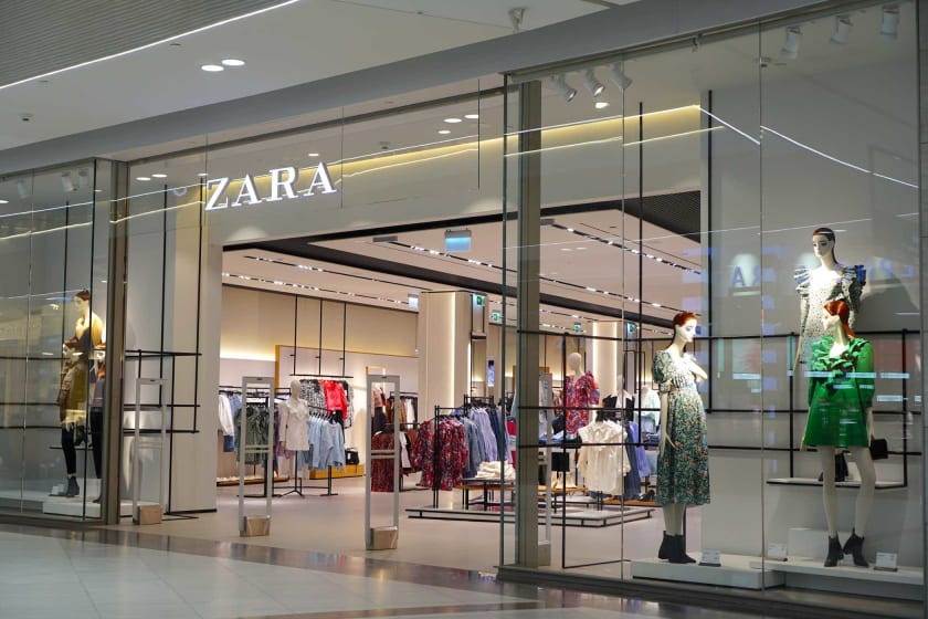

The placement of products plays a crucial and traditional part in in-store shopping, catalogs, or online displays. Creating visual concepts, depicting your brand's story following the current trends, and keeping a note of the future trends helps put the best foot forward. People in the fashion industry know the role of lighting, decor, floor plans, and other visual elements in motivating customers towards purchasing a product. As a brand owner or stakeholder, boosting sales is essential for creating a better brand image, but it is challenging to make time for it.
To relieve you of your worries, we have compiled a list of the top strategies used by the visual merchandisers at Zara and H&M to captivate their audience.
Create a Cohesive Visual Experience with Colors
Colors can be easily used to create a cohesive visual experience. Most visual merchandisers decide on a color scheme used throughout the retail space and website to attract customers to the brand's story. One thing to take care of is limiting the number of colors you work with to create cohesive and harmonious visuals without overwhelming the target audience.
Create Displays for the Target Audience
While this may seem like an obvious point, it can be used to reach the customers who are willing to connect with your brand. Setting the tone of the customer as soon as they discover the brand is essential. Expert visual merchandisers advise that brands should appeal to the target customers' lifestyles to attract them.
Use Lighting to Draw Attention to the Merchandise
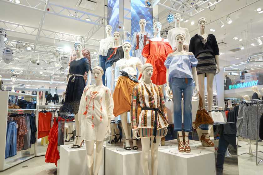
Lighting choices create an atmosphere and help define your store's mood. Here are some points that experts suggest:
- Make sure that the entire space is lit since any merchandise that is not visible will deter customers from buying them.
- Decide on the type of lighting as the ambiance depicted depends on it. E.g., Warm lighting helps create a mellow and calm mood, while brighter and cooler lighting is used to maximize visibility and express energy.
Do Not Overwhelm the Customers
Overcrowding a space with several merchandise items and clashing colors looks chaotic, which can drive the customer away. Avoid clutter and focus on spotlighting a single item or a few to create a cohesive visual experience.
Use Signage as a Visual Guide
Signage can be effectively used to highlight certain merchandise products, guide customers to a collection, and share information. Visual accessibility helps customers understand the store and interact with it. The added accessibility eases the information-providing process and improves the customer experience.
Keep the Signage Short

Displays are crucial, but so are texts that provide information. Wordy signs look overbearing, and customers would never pause to look at them. Try to maintain the 5-second rule: if you can read the sign within 5 seconds or less, keep it, else try to edit and shorten it. In case of a longer message, opt for a series of signs with aesthetic placement.
Highlight the Point of Purchase (POP)
A Point of Purchase Display is a temporary display located around products to be advertised or featured. Statistics prove that pop displays inspire eight out of ten customers to make impulse purchases. Thus, pop displays are a great way to sell a product faster and easier.
Focus on Window Displays
Window Displays help attract foot traffic and are a great way to show the variety provided. They are the point of first impression, so make sure that they are well-lit and clean.
Create Focal Points
Creating focal points throughout the store helps guide customers through the space and draw them to the point of interest. Think of the areas that hold most of the merchandise. These are the spaces that you want your customer to focus on and are a possible focal point.
Improve Employee’s Sales Knowledge
The sales team needs to be aware of the visual merchandise to assist the customer with any questions or processes.
Zero In on a Music Genre
Music helps enhance the ambiance and impacts the customer's brand view. Evaluate the mood you want to create and the product aesthetic to select a genre complimenting the visual merchandise.
Keep Track of Weekly Sales
It is crucial to analyze weekly sales to evaluate the displays' impact on them to put effective visual merchandise. Keep changing the displays regularly to accommodate newer customers and to keep it fresh for regular customers.
Pay Extra Attention to the Store Layout
A store layout refers to the shelving and arrangement of furniture pieces. It impacts traffic flow, customer movement, and the shopping experience. Consider the volume of merchandise to display and choose a layout that doesn't seem too overwhelming.
Audit Stores for Merchandising Compliance
Statistics suggest that 60% of promotional displays are not appropriately placed, which wastes time and money invested. Conduct merchandising compliance audits regularly to showcase the best.
Use Product Placement for More Sales
Product placement is a technique in which products are placed throughout the store to draw attention and make it more likely for customers to purchase them. Experts suggest that products that result in larger returns for the brand should be featured.
Group Related Products Together
Grouping similar products help to guide customers throughout the store and make them look more aesthetically pleasing. Whether you choose to group products by use, type, or color scheme is up to you.
Rethink Interior Spaces
Most high-end brands have started investing in augmented reality to show off products and optimize in-store navigation. These technologies came into focus due to the pandemic, and it looks like they are here to stay.
Avoid Excessive Empty Space
Utilizing the available space is key to visual merchandise. Breaking up the inventory display and avoiding clutter helps maximize customer exposure. However, if you showcase fewer products, it might seem that you do not have an extensive collection.
Stay in Touch with Customers using Seasonal Displays
Seasonal factors should always be considered when displaying products. If it is during a holiday, include products for the same so that your business seems more relatable.
