Why Is The Pantone Reference Book The Most Important Tool?

Colour is perceived differently by each individual. What may be a crimson to one person may be a vermilion to another. Colour can also differ by the material on which it is applied. The shades and hues that an artist wants have been communicated to the manufacturer and the supplier in commercial production chains. With so many moving parts and different sets of eyes, uniformity can be challenging. Colour discrepancies are handled by consulting the universal colour authority, the Pantone Book.
What is Pantone?
The Pantone Book is essentially a dictionary but for colours. In the 1960s, Lawrence Herbert, a recent Hofstra University graduate, had systematised and simplified the company's stock of pigments and production of coloured inks. This approach to printing made the company profitable, and Pantone was born.
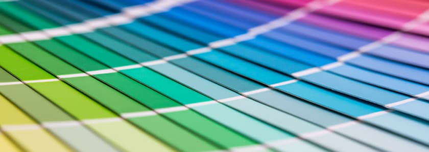
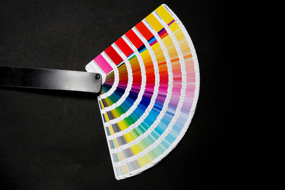
Pantone Guides or Pantone books are made up of many small, thin cardboard sheets printed on one side with a series of linked colour swatches and bound into a compact "fan deck." The colours are assigned a code according to the Pantone Matching System. When a design hits the production stage, the PMS allows designers to "colour match" specific colours independent of the equipment used to create them.
Pantone Colour Systems
Pantone has two colour systems. There is a need for separate colour systems due to their reflective and absorptive properties. The pigment remains the same, but the way light reflects off fabric and paper is different. In addition to that, different artists have different needs. For example, fashion designers require more whites, blacks, and neutrals in their palettes. In contrast, print and packaging designers require vibrant colours that stand out on the shelf. The Pantone Matching System (PMS) and The Fashion, Home + Interiors (FHI) System are the two colour systems that Pantone currently employs.
Pantone Colours for Textiles
The colour achieved in the end depends on the material used. Designers and manufacturers can evaluate and change the values of the pigment before production using Pantone's digital tool and Pantone Book. This handy tool helps save time money and, more importantly, prevents creative exhaustion.
The Pantone Book for The Fashion, Home + Interiors (FHI) System is made with swatch cards. The Pantone Swatch Card has been developed for colour constancy. It is made on a double-layered cloth to meet the industry's most demanding colour requirements. Pantone also has digital spectrum data that supports all FHI Swatch Cards, ensuring that the final product matches the initial vision. Each substance has its own set of qualities. Thus a particular set of shades can only be achieved by that material. All cotton, nylon, and polyester colours are available with the swatch cards. New colours are added to the Pantone book every year.
As fabrics absorb colour more than any other media, the TCX Pantone samples are dyed to assist textile designers. Pantone TCX (Textile Cotton Edition Extended) Range provides colour charts that assist textile designers in determining the required hues. Pantone TCX swatches are dyed on 100% cotton, offering users greater shade precision. The swatches' medium is crucial because they are supposed to mirror the colour shown on the final product.
Therefore, a TCX cotton swatch provides the accuracy of the desired hue for the textile business that deals with fabrics. A single colour code will provide all hue, vividness, and intensity information with the Pantone Book. By delivering the colour used in your design or artwork to a manufacturer. The reproduced print will be colour-consistent and accurate to the original style.
Why is Pantone so important?
The Colour of the Year campaigns by Pantone can drive sales towards unexpected profits. The Pantone colour of the year decides the colour trends for a whole year. From clothing to marketing and even politics, the colour of the year has a lot of influence on various industries. The Pantone Color Institute researches colour trends all year to determine the next Pantone Colour of the Year.
The Pantone Color Institute's extensive colour trends analysis saves companies many hours of marketing research for their own company. The Pantone Color of the Year is a consumer colour trend forecast, implying that it's meant to be used in consumer items and client projects.
Why use the Pantone Book?
Working with many suppliers might result in different methods and equipment, resulting in wildly different colour effects. Pantone’s physical, digital, and cloud-based colour solutions help verify that all of your suppliers are shooting for the same goal, resulting in consistent outcomes. The colour of the products needs to match each other and match previous batches and the batches that will be produced next. Pantone has developed colour measuring and evaluation technologies that allow for consistent colour from each production run, regardless of when or where it is generated.
Designers can now send their art and know the outcome with the Dyestuff Formulations, Certified Printers, Extended Gamut Printers, and Calibrated Printers. Manufacturers and suppliers have to stick to the formula that Pantone provides. Pantone supplies the globe with a constancy that designers could only dream of with over a thousand pure colours.
Pantone not only releases updated colour books at regular intervals, but the colours in the books degrade over time. It is recommended that designers and manufacturers only utilise Pantone books acquired within the year to guarantee the best results. It is recommended that colour guides before 2004 not be used as Pantone had updated their prints that year.
The Pantone Book can also help create a seasonal palate as Pantone now publishes colour trend studies for fashion designers and the PCS. The Institute's team evaluates the colours used by designers in their collections at New York Fashion Week every season. With the information gathered, the Pantone Fashion Colour Report is prepared. The top 10 colours for the coming season are highlighted in the research.
Pantone’s Newest update
The 2018 Pantone Book introduced 400+ new colours on Polyester (TSX) and for Metallics effects (TPM). The new Polyester colours were chosen to match the existing cotton collection while expanding Pantone's synthetic offering. With the inclusion of 203 additional hues that broadens the colour palette, multi-material design has never been more straightforward.
Pantone Polyesters
Pantone's polyester standards, which are part of its Fashion, Home + Interiors System, are perfect for athleisure, footwear, swimwear, sleepwear, and the home and fashion accessory markets. These products, dyed on 100 per cent polyester, can be used to colour polyester, poly-blends, and other synthetic materials. The new Pantone Polyester Swatch Book has 203 unique colours, ranging from classic neutrals to vibrant neons, not accessible in the existing cotton library.
The polyester updates are offered in three formats to complement the existing Fashion, Home + Interiors system:
- The Polyester Swatch Book is a complete set of 203 original, forecast-driven colours for garments, textiles, and soft home designers and colourists. Pantone's Polyester Swatch Book is an easy-to-use colour portfolio with 2"x 2" tiny swatches in a new, redesigned binder structure.
- The polyesters are also available in Individual colours in 4"x4" swatches that expand to 4"x8" for optimal colour vision, specification, and instrumental evaluation in polyester swatch cards
- Pantone also offers Spectral Data for Polyester, i.e. specific dye formulas for each hue to aid in achieving colour intent in production.
Pantone Metallics
Metallic Shimmers products are designed to give designers and production partners a complete selection of colours in various formats to make their jobs easier. This new colour category allows for consistent colour communication and visualisation for pearlescent/metallic finishes, rather than finding material samples and losing time due to reproduction constraints.
The brand new Pantone Metallic Shimmers are available in three formats:
- The Metallic Shimmers Colour Guide is a portable fan guide format with a single colour featured on each 1.75" x 6" page for rapid colour reference and inspiration.
- The Metallic Shimmers Color Specifier has one colour per page of perforated 20 mm x 30 mm chips to add to mood boards, product designs, or delivery to production partners.
- The Metallic Shimmers TPM Sheet is a Full colour 8.5 x 11" sheet that allows easy communication, specification, and evaluation throughout the manufacturing process.
Conclusion
Colours have the power to give emotions an external canvas. Pantone's system of colour matching has become so well-known and respected throughout time due to its intuitive and instinctual handling practice. In addition, the Pantone Book has made the design and production process easy.
As Pantone helps simply the productions here at Fashinza, the aim is to simplify the manufacturing process for designers by connecting designers with vendors to help them manufacture their collections. Brands only need to place the order; Fashinza handles the complete production process from placing orders, tracking them, getting daily production updates, contacting manufacturers, and paying for them. Fashinza is a one-stop shop for fashion brands looking for easy manufacturing.
Share this Story