What is Pantone and why is it important?

Summary: Pantone 448 C color goes by several names - drab dark brown, olive green, olive drab, drab and the ugliest color in the world. Does the color have any use or not? Let's examine the world's most drab color.
Anyone working in the fashion, graphic, print, and design industries knows how important Pantone is. Today, everyone is bombarded with visuals 24X7, and color plays a very important role. Tiffany blue, Chanel black, or Hermès orange, these iconic brands are identified with their distinctive color, and the colors have a specific value assigned to them. For brands to ensure that their colors are the same everywhere, they use this specific value.
This brings us to the company that helped standardize the color. Lawrence Herbert founded Pantone in the 1960s. During the early days, he noticed that there was a lack of consistency in the way the colors were specified and reproduced. He then developed the Pantone Matching System (PMS), a standardized color reproduction system. PMS uses a unique numbering system to identify and match specific colors. The PMS is widely used in the printing, graphic design, and product design industries.
Today Pantone has become a leader in the color industry. It has expanded its product line to include a variety of color-related products and services. With the technology evolving, Pantone also introduced the digital version of their color matching system, the PANTONE Connect, which is available for Adobe creative suite and other digital tools.
Being the original trendsetters, they now come up with color of the year every year. And one of their rather famous color is Pantone 448 C.
What’s in a name?
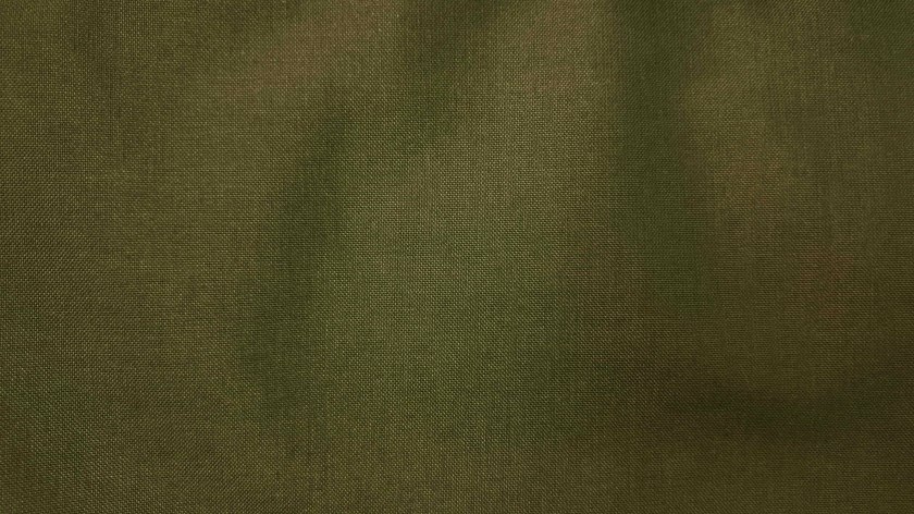
Pantone 448 C was first introduced in the PMS system in the 1970s. History has given Pantone 448 C many names - Olive drab, opaque couché, drab or drab dark brown, and the most famous of all "ugly." If one were to describe the color, it would be a dark muted green color. Some people describe it as having a dull and unsaturated appearance thus adding more meaning to its nickname.
Initially dubbed olive green, it was changed to drab dark brown. Reason? The Australian olive growers expressed concern about it damaging the olive’s reputation. It was perhaps the most defining moment in the history of color. Pantone 448 C unofficially became the world’s ugliest color.
Ugly still has its use
A market research firm surveyed 1000 smokers, and they said the Pantone 448 C color was unappealing. In 2012, the Australian Government announced that all tobacco products will have Pantone 448 C packaging. They removed the distinctive and highly desirable branding colors with color the smokers found the least bit attractive.
Israel is the newest entrant in the embrace Pantone 448 C color. It has followed in the footsteps of Australia to use the power of "drab" to decorate cigarette and tobacco packs. So like every color has its day, Pantone 448 C has proved useful in the most unusual way.
Controversy is thy name
Critics have argued that the use of such a drab color on cigarette packaging was a form of stigmatization and that it infringed on the rights of tobacco companies to market their products. Additionally, some experts have expressed concern that the dark color may make the text on the packaging difficult to read, which could potentially lead to confusion among consumers.
On the other hand, some experts and health organizations support the use of plain packaging as a measure to reduce smoking rates and prevent young people from starting to smoke.
Never has color been so powerful that nobody wants to associate with it. Teen Vogue’s article called it yuck, death, dirty, and tar. House Beautiful called it a sewage-tinged hue. The names for Pantone 448 C are truly creative, disturbing, and controversial.
The unfashionable color
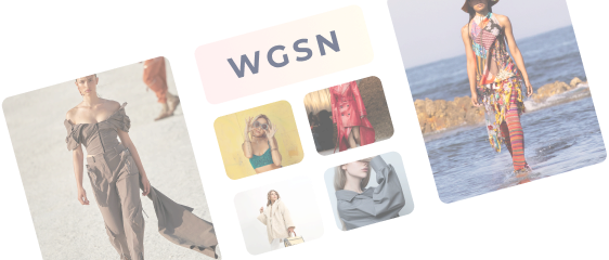
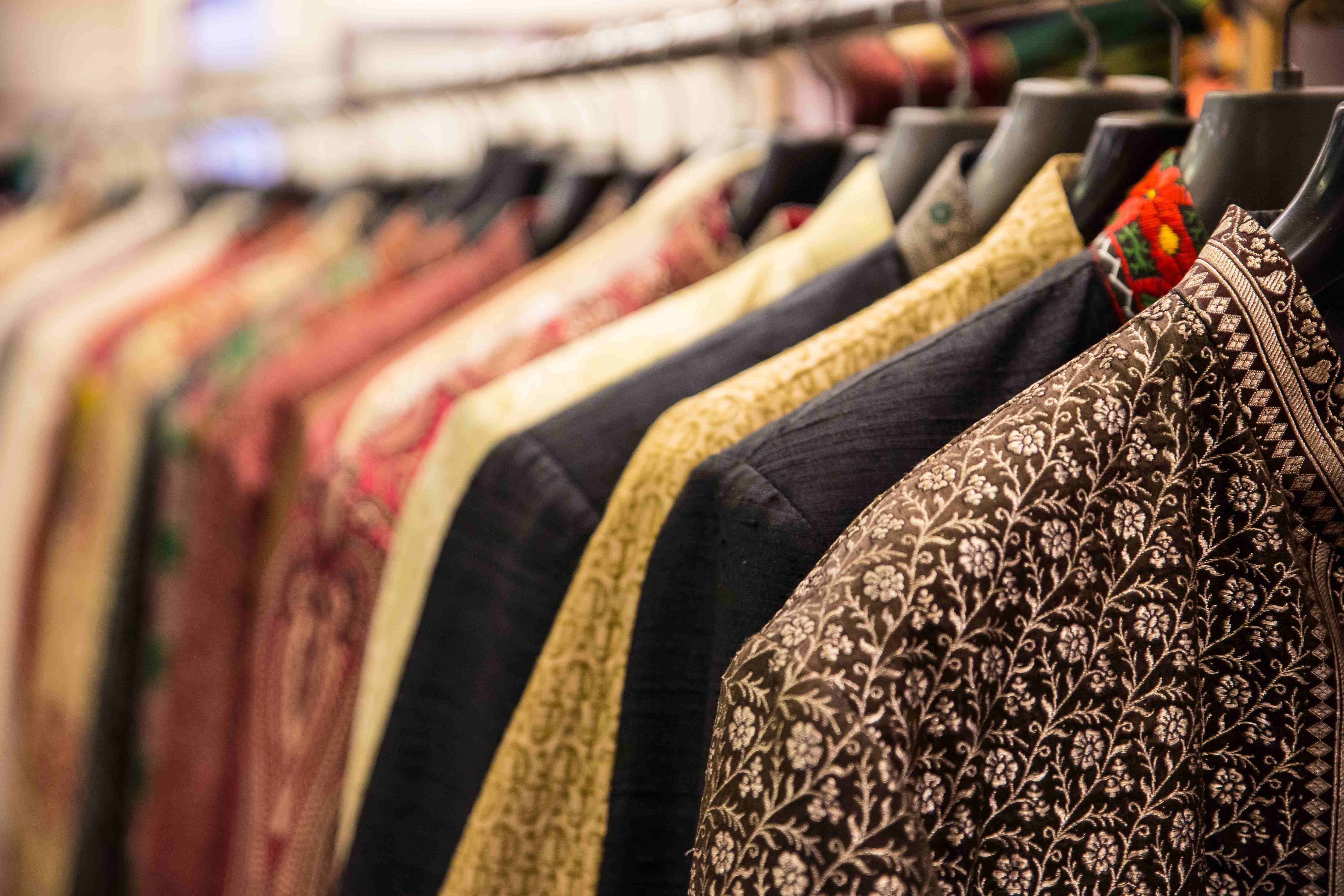
Pantone 448 C has not been widely used in the fashion industry. Since the color is infamously associated with plain cigarette packaging, it is not typically seen as a fashionable color. Fashion designers are known to be bold and audacious but something about this color is not making them take risks.
However, it might be possible that the Pantone 448 C color has been used as a part of a collection; the news is not confirmed on that one though. Hope a fashion designer or an adventurous fashion brand out there has done it or might do it in the near future. The world would like to witness the ugly turning into beauty.
Will millennials wear it?
Millennials are generally considered to be more health-conscious than previous generations and are more likely to be concerned about the negative health effects of smoking. Therefore, a significant proportion of millennials may view Pantone 448 C as an effective measure to reduce smoking rates. And a big no-no for personal fashion.
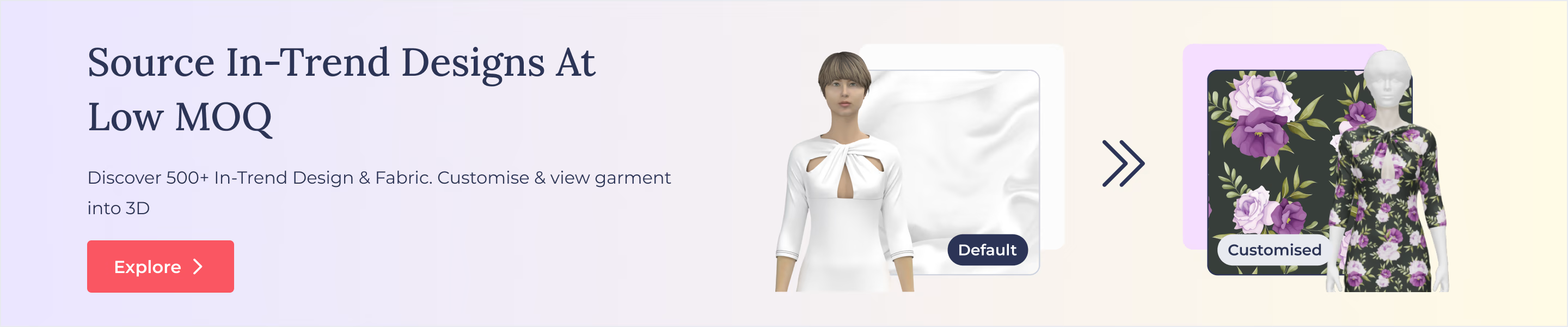
For a budding brand or an upcoming fashion designer, it is important to understand the trends and colors. Using color without understanding the past and its association can prove detrimental. Fashinza with its reports and trends keeps you up to date on matters of concern.
Talk to Fashinza expert today.
Key Takeaways
- Pantone 448 C is dubbed the world's ugliest color
- Australia now uses this color on its cigarette and tobacco packaging
Share this Story